Landscape photography is all about the composition. This is the niche whereby a photographer transcends into the space of art. No need for specialized gear or even an otherworldly subject- here, what matters is the beholder. The visual appeal of a landscape image is not dependent solely on the subject, but rather on the image as a whole.
However, just like all those times you gave a speech or tried to express your true feelings, the trick lies in the execution. Perfecting your composition techniques is a simple matter of practice, so let’s review the basics.
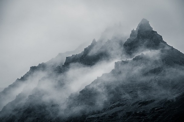
Leading Elements
Think of a leading element as the bait- something that will trap the viewer’s eye for that one split second it takes for him to become captivated.
A leading element can be anything with fluidity or interest-something with a natural pattern, a progression of shapes, or curved lines. Next time you look at an intriguing image, look for that “line” leading from the foreground toward the subject. You’ll start to notice it more and more often, especially in very powerful images.
Leading elements effectively take advantage of the human eye’s tendency to follow certain patterns. When it comes to landscape composition, you want to ensure that the viewer follows a design- your design. After all, photography is only an art form if you are able to convey what you see- not what your camera would have captured at the press of a button.
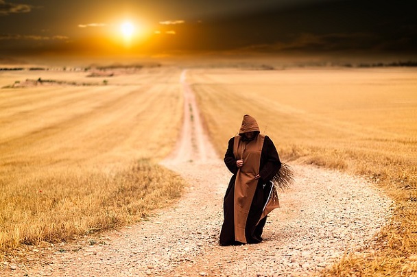
Foreground
Landscape photography can be flat and boring if you neglect the foreground.
A photograph is two-dimensional, but it doesn’t have to appear that way. Foregrounds are a vital compositional factor, adding depth and substance to an image. In many cases, well-thought foregrounds can also add tone to an image, providing detail for the senses. A good image tells a story-a great image, suggests one.
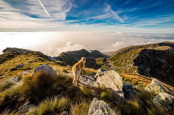
Balance
Good composition is balanced.
Balance is not the same as symmetrical and for Pete’s sake, don’t go on trying to create symmetry- it can often come across as lacking in creativity. No, balance simply means that when you look at your image,nothing “sticks out” too aggressively. “Aggressively” is the key word here, of course you want something to shine, but not so brightly that it casts a glare on everything else.
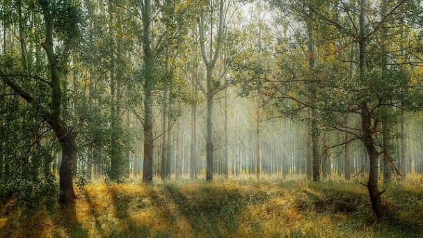
The Rule of Thirds
Given that you are currently reading this, I’ll assume your interests in compositional techniques has already introduced you to the”rule of thirds”.
While not all professional photographers follow the rule of thirds and others do so naturally, this technique makes up the very foundation of compositional design- it goes as follows:
When you look into your screen, divide the frame into three sections, both vertically and horizontally- you’ll notice a square in the middle. Pay attention to the four corners of that centered square.
Rather than using the center square to “frame” your subject, the idea is to place points of interest on either, some, or all of the four corner points as the eye processes an off-center image more easily.
Even if you don’t go strictly by the rule of thumb, notice where you place your horizon on landscape images. You’ll find that a good photograph almost always places the horizon along the top third of the image, right along the division line.
Movement/ Energy
Phenomenal images are dynamic and this can be achieved with landscape photography via the caption of energy through movement.
Crashing waves, dispersing clouds, speeding cars, or a moving body are good ways to incorporate energy into your shot. Just make sure not to topple the balance.

Use Negative Space
Negative space doesn’t have to be so negative. Actually, simplicity can be calming and even dramatic.
Negative space is more effective in the company of a strong, isolated subject. An exquisite orange blossom in the midst of a green field or a jaded street cat on an expanse of wet concrete are good examples of useful negative space.
Frame Your Image
Framing is not cliche if you have a unique framing mechanism and an intriguing subject. Also, a frame doubles as foreground interest.
Framing is one of the simplest ways to compose an image, yet it can convey deeper aspects of the background, such as the position of the photographer and point-of-view details.
Make framing interesting by looking for opportunities to frame within a frame.

The Vanishing Point
So many landscape photographs emphasize the horizon- make the image even more visually appealing by seeking out a vanishing point.
The vanishing point is a very architectural characteristic used across a wide range of art forms. It’s been used since medieval times to convey three dimensions and its symmetrical nature adds a certain sharpness to images.
Make it Simple
With all this talk about composition and all the tiny technical details, it’s easy to end up with an overwhelming image. Don’t stress it- rules are made to be broken (or improved upon).
A well-composed landscape can be aesthetically pleasing even without extensive detail. What matters here is that you take a picture that conveys your perspective.
Source: Digitalphotoshack.com

